A Logo Worthy of 75 Years
March 7, 2022Making our Mark
When you have a big milestone in anyone’s life, you naturally try to commemorate it with something worthy of the occasion. It’s no different for us here at Van Kam! In case you haven’t heard yet, this year marks our 75th Anniversary, so we wanted to create a commemorative logo that would be used to represent our diamond anniversary.
The trick was to make the logo unique, but be complementary alongside our other brand marks, such as other logos found on our company communications and fleet equipment – most notably, our vintage Van Kam logo found our tractors and trailers. These have been regularly seen on the roads and highways throughout Western Canada since 1947.
A Bit of Introspection
After days of brainstorming ideas and concepts, we decided on creating designs that would echo our story of a three-generation, BC family-owned business operating in Western Canada. Initial designs included everything that one would assume when thinking of Western Canada, like trees, mountains, lakes, and trucking/transportation themes. Ultimately, we felt the designs were too literal and did not match the simplicity of our two current company logos.
Two For One
To accommodate the vintage logo on our fleet equipment, we would need two logos: one for our trailers and another for everything else (“non-trailer”). Even though we were going to have two different designs, we still needed to have some continuity between them on their own. To do this, we went back to the drawing board and stripped away the literal components of our initial designs and instead incorporated subtle graphic hints to support our historical story.
The Many Facets of a Diamond
Since 75th anniversaries are traditionally known as “diamond anniversaries,” we mimicked the facets of a diamond into the stylized “7” and “5”. This chiselling effect also projected a sense of tradition and history and added depth to the numbers – – which were ordinarily flat on our previous commemorative logos.
An Obtuse Bridge
For added continuity between these two new 75th logos, we wanted to use the black, red, white, and green colours, which are collectively found on our vintage and current Van Kam logo. The challenge was how do we incorporate the green into the non-trailer logo without it being overpowering?
This dilemma was solved by adding the green obtuse triangle below the red ribbon. This obtuse triangle is found exclusively on our trailers as a backdrop for the vintage logo, and it’s the same green used on the bumper striping that our tractors are renowned for. It was perfect for incorporating the green and bridging all our logos while still retaining some individuality. (Finalized logo shown at top of page)
A Riveting Tale
Rounding out the design is the reversed maple leaf to represent our Canadian roots and a nod to our three generations of family ownership by placing three rivets on the top corner points of the shield logo. The rivets also signify the solid foundation Van Kam is built upon, and doubles as a representation of how most of our freight trailers are held together… with rivets!
What’s Your Story?
To celebrate our 75th, we’re inviting you to contact us with your most memorable experiences with Van Kam! We would love to hear your stories and comments, and upon consideration, we may even request to feature your story in an upcoming newsletter or blog/social post. You can reach out to us at marketing@vankam.com.
We look forward to hearing from you, and be sure to keep an eye out for more stories and online content as we celebrate throughout 2022!
Stay Connected!
Connect with Van Kam on LinkedIn, Facebook and Twitter.
Subscribe to our newsletter for future Van Kam stories!
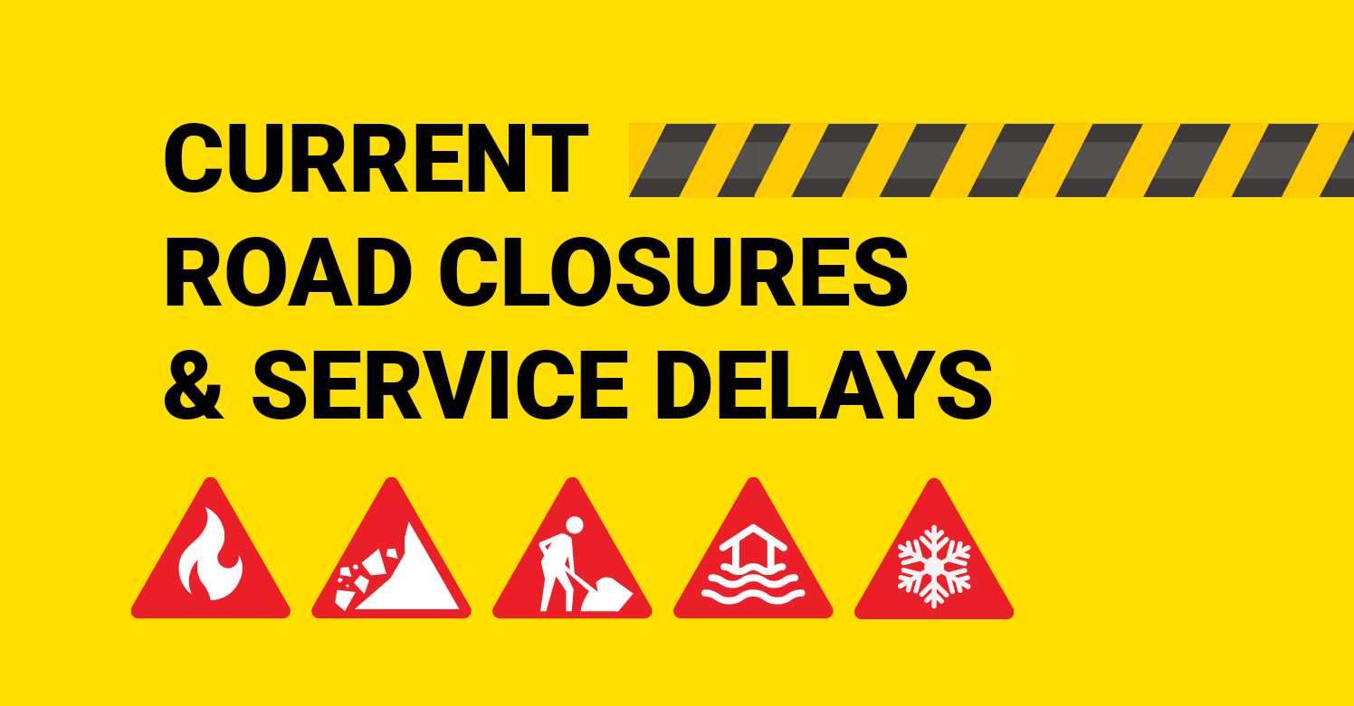
View All Regional Service Delays Below Road closures are mandated by the BC Ministry of Transportation and directly affect the ...

Over the past five years, Van Kam Freightways has proudly partnered with KidSport, supporting young athletes in overcoming financial hurdles ...
As we celebrate a significant upcoming milestone this year for our very own, Balwant Gill, who has been a steadfast ...

Van Kam proudly celebrates Les Topp, one of our Senior Linehaul Drivers, who will be celebrating his 25th anniversary at ...
Recent Posts
- April 2, 2024
- Current Road Closures and Service Delays
- April 1, 2024
- Half a Decade of Championing Youth with KidSport
- April 1, 2024
- Balwant Gill: A Quarter Century of Dedication at Van Kam Freightways
- April 1, 2024
- Van Kam Celebrates Les Topp’s 25 Year Legacy
- March 1, 2024
- Empowering Change: Van Kam’s Tribute to International Women’s Day
- March 1, 2024
- Van Kam Freightways Supports Women’s Health, Donates to BCWHF
- March 1, 2024
- Meet Ryan Dewar: Van Kam’s New Surrey Terminal Manager
- February 1, 2024
- Welcome Aboard: Jessica Drake Charts a New Course with Van Kam
- December 21, 2023
- Reflecting on Van Kam Freightways’ Journey Through 2023
- December 21, 2023
- Van Kam Collaborates with Artist Rush Dhillon to Visualize Core Values